<SELECT> options are way too long
in Select Option entries are cut on the right side if they're too long - Javascript / DHTML / Ajax This is another post of mine on TheScripts. This one is pretty interesting because it is a solution of one of those age-old problems: what the crap are you supposed to do when you have a ton of content in a drop-down. It looks SUPER ugly if you just stretch it across the whole page. At first I scoured the web for a way to get the dang lines to wrap. A few sites I found erroneously pointed to some tard's posting on a forum that said just throw BRs in there. I looked all over the place in hope that there was a CSS solution but to no avail. Apparently the HTML select tag can't wrap ever no matter what. Boooooooo.
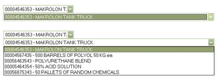
 Above is a screenie. The top select on each of the two sets is w/ no mouseover, the bottom is when you interact w/ the select.
Finally, I wrote something of my own. It won't do wrapping, but it does fix the problem. I made the select box elastic. When not in use it is a small little thing with a preview of what the selected option says. When moused over or clicked it expands long enough to display all of the text, then shrinks back up when you're done with it. I didn't get really tricky and animate the motion or anything, though that would be neat. It is just functional at this point.
The problem got really interesting when I had to deal with event bubble and trickle. That's such a pain. I got help from the usual sources - w3schools for reference, quirksmode, Dr. Dailey's page. I should post a demo but I'm not feeling up to it at the moment. If you want the src or a demo just comment or snag it from theScripts.


0 Comments:
Post a Comment
<< Home